
Sushi Train
In-house brand and campaign design across a 50+ location franchise network, 2024–present.
The scope of design work spans storefront window vinyls, packaging and merchandise, print and digital signage, social media, campaign collateral, and video - delivered in-house across Sushi Train's franchise network in NSW and QLD.
Campaign Collateral
Signage
Motion & Video
Packaging & Merchandise
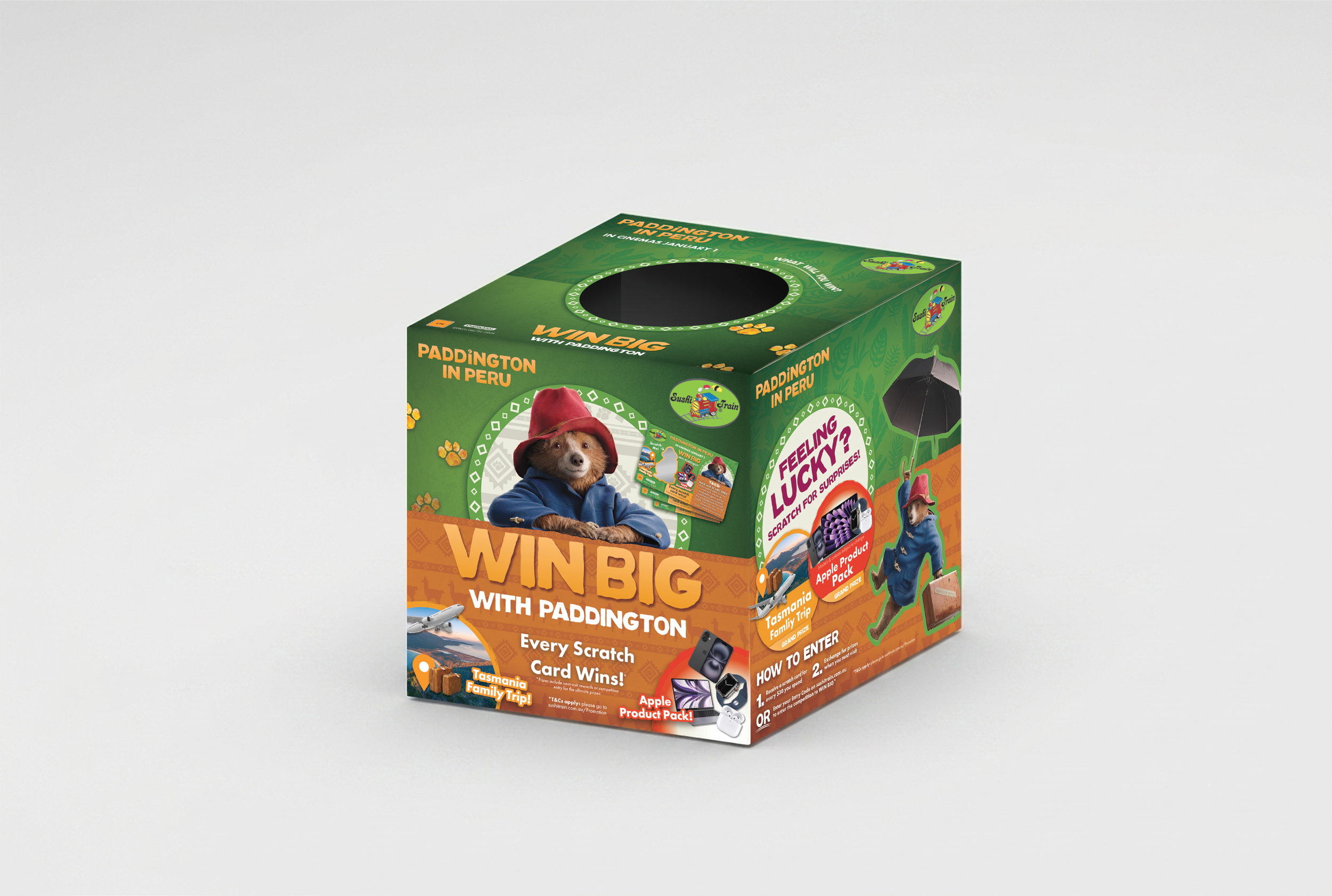
Paddington in Peru and Sushi Train Campaign 2024
The Bad Guys 2 and Sushi Train Campaign 2025
Store Signage Objective
Modernise dated storefront without losing the brand's family-friendly character
Keep a 50+ location network visually consistent and on-brand
Build a flexible vinyl system that adapts to varied storefront formats
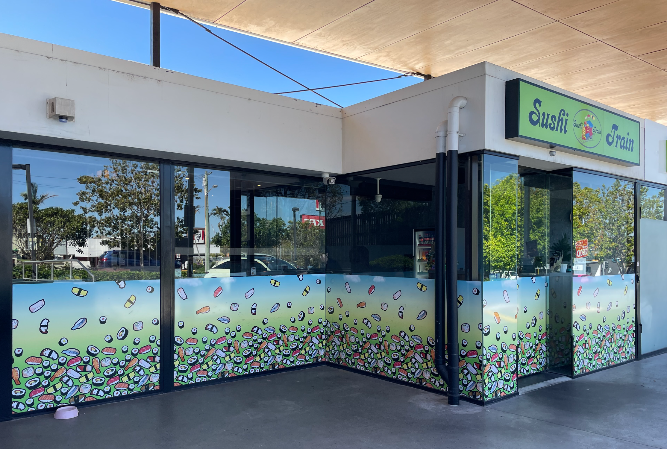
Before
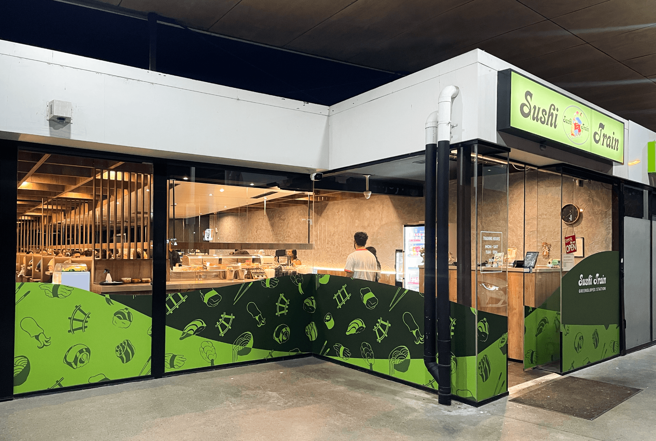
After
The previous vinyls carried a highly detailed 3D sushi pattern over a green-to-blue gradient - a design that had served the brand for nearly twenty years but had become dated, with a busy pattern locked inside a static, straight-edged layout. Sushi branding typically reaches for a sophisticated palette, but Sushi Train deliberately targets families; the brand needs to make sushi feel approachable rather than exclusive. The challenge was modernising without losing that warmth.
The new design moves to a minimal, single-colour 2D sushi pattern set within a wave-shaped layout, replacing the old flat cut-off edge. The wave brings movement and a casual feel, references the company's beginnings in Surfers Paradise, and works as a flexible system - each storefront has a different number and size of windows, and the pattern can be shaped to fit each space naturally rather than forced. Colour is restricted to shades of Sushi Train's recognisable green, building on equity the brand already owns, while the overall aesthetic stays clean and professional - essential for a brand serving raw food.
The new design is being rolled out progressively as store signage comes up for renewal.